
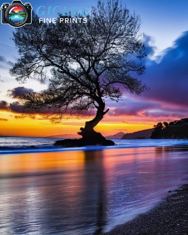
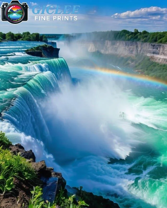
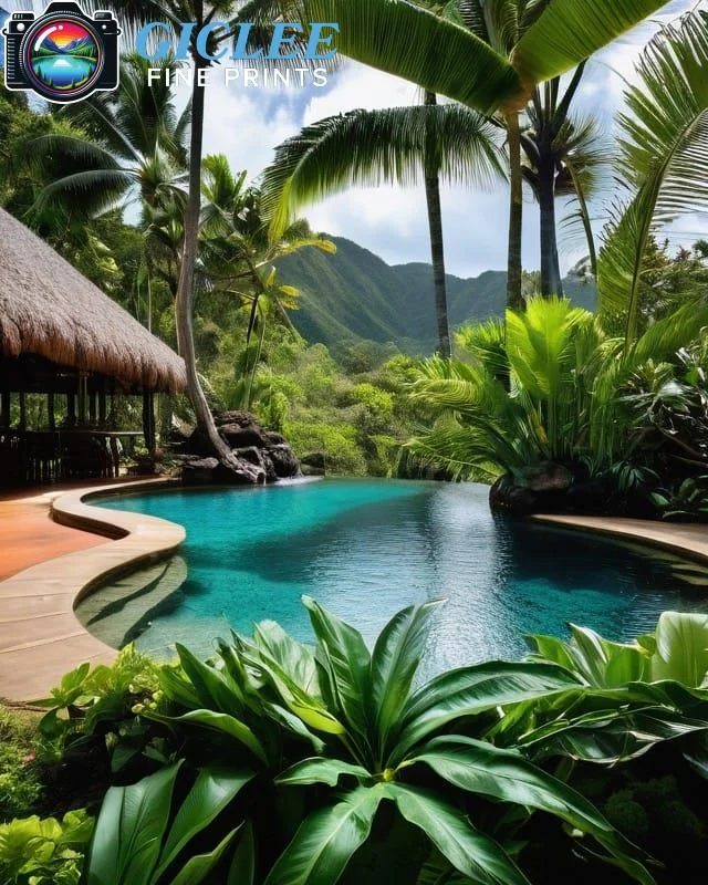
As an artist or photographer, it’s super important that the colors you see on your computer screen match the colors in your final print. Whether you’re printing on canvas, fine art paper, metal prints, or peel-and-stick wall art, getting the colors right is the key to making your artwork look just the way you want. The best way to do this is by calibrating your monitor.
Understand the Importance of Calibration
If your screen is too bright, too dark, or the colors look strange, the colors you’ve carefully adjusted in your editing program might not match when you print them. Calibration helps balance the brightness, contrast, and color temperature of your monitor, so you can be sure that the colors you see on your screen will look great in print.
Why it matters:
- Ensures the colors in your fine art paper prints match the soft shades you want.
- Prevents your canvas prints from looking too dark or washed out.
- Keeps the bright, vivid colors in your metal prints just right.
- Makes sure your peel-and-stick wall art looks as colorful and crisp as you designed it.
Use a Hardware Calibration Tool
You can adjust your screen settings by eye, but the best way to make sure your monitor is showing accurate colors is by using a special tool called a colorimeter. This tool reads the colors on your screen and adjusts them to match real-world standards.
Pro Tip: It’s a good idea to invest in a good calibration tool and use it every month or before big projects to keep your screen’s colors consistent.
Work in a Controlled Environment
The lighting in the room where you work can change how you see the colors on your monitor. If your room has a lot of bright sunlight or colored walls, it can make your screen look different from what it really is.
Tips:
- Work in a room with neutral-colored walls and steady, controlled lighting.
- Make sure sunlight isn’t shining directly on your screen.
- You can also use a monitor hood to reduce reflections and glare from lights around you.
Choose the Right Color Space
A color space is a set of colors your screen can show. When you’re editing, it’s important to pick the right color space to get the best results for printing. For example, Adobe RGB is a good choice for professional printing because it shows more colors, which is perfect for printing vibrant metal prints, rich canvas art, or delicate colors on fine art paper.
Remember:
Before sending your files to a printer like Giclee Fine Prints, ask them what color space they recommend for the best results.
Why Choose Giclee Fine Prints?
At Giclee Fine Prints, we want your prints to look exactly the way you see them on your screen. Whether you’re printing on canvas, fine art paper, metal prints, or peel-and-stick wall art, our expert team and advanced printing technology ensure that your artwork stays true to its original colors.
Contact Us
Our address is: 3816 Pioneer Trail Ste #3, South Lake Tahoe, CA 96150
Email: Info@gicleefineprints.com
FAQs
It’s best to calibrate your monitor at least once a month or before starting any big projects to keep your colors accurate.
You can try adjusting your monitor by eye, but using a colorimeter is the best way to get precise, professional results.
Yes! Calibration still helps even if you work with only black-and-white images. It ensures that the shades and tones are accurate.