
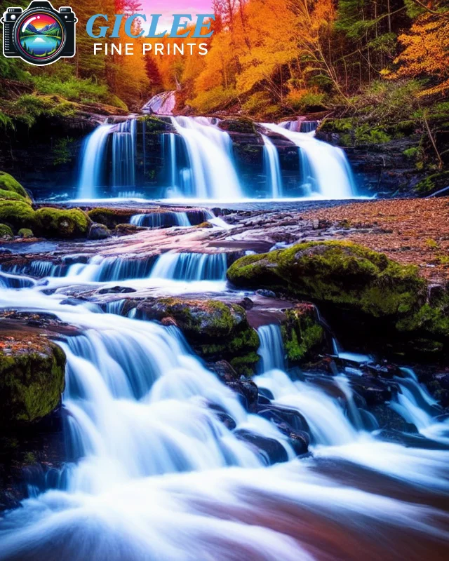
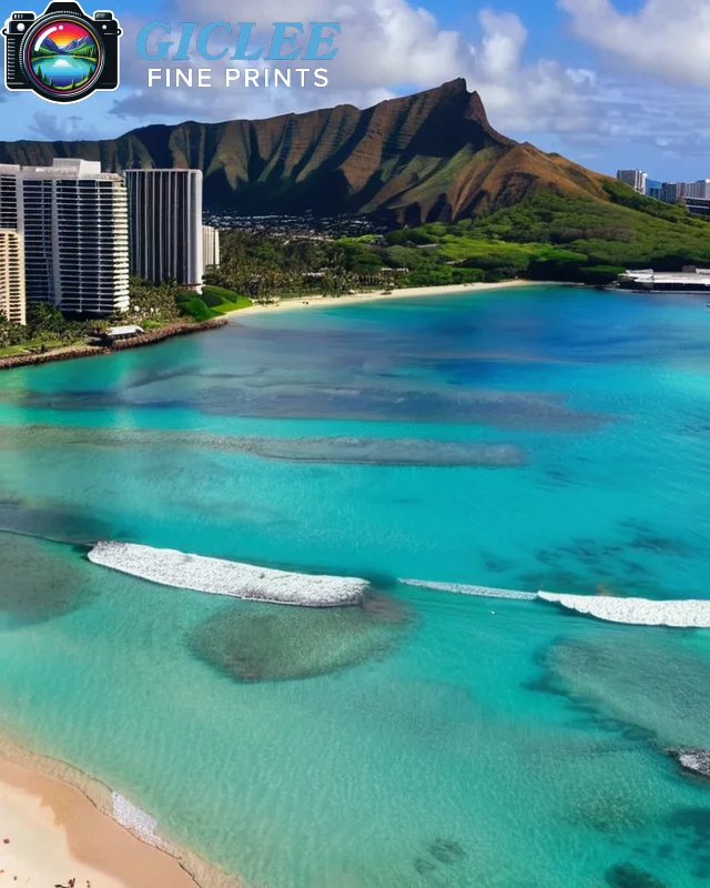
Preparing your artwork or photography for print requires careful attention to detail to ensure the final product is true to your vision. From file resolution to color settings, each step of the process contributes to achieving a professional, high-quality print. At Giclee Fine Prints, we provide expert guidance to help you master the print preparation process and bring your work to life with precision. Here’s a step-by-step guide for successful print preparation.
Choose the Right File Format for Quality and Compatibility
The file format you select can influence the quality of the print, especially when dealing with color and resolution. High-quality formats preserve details and colors better than compressed formats, making them essential for professional printing.
Best Formats for Print:
- TIFF: TIFF files are widely used in print due to their lossless quality and ability to handle detailed images without compression. They support high-quality images and a broad color range, making them ideal for fine art and photography.
- PNG: PNG files also provide lossless quality and are suitable for images with transparent backgrounds, although they aren’t as commonly used in professional printing.
- JPEG: JPEGs can be used if they are saved at the highest quality setting, but they may lose some detail due to compression. They’re better suited for smaller prints or digital previews.
Best For:
- High-resolution artwork and photography where quality retention is crucial.
Set the Optimal Resolution for Clear, Sharp Prints
Resolution is a critical factor in print quality. The higher the resolution, the sharper and clearer your print will appear. Aim for at least 300 DPI (dots per inch) to ensure details are preserved, especially in large-format prints.
Key Tips:
- 300 DPI Minimum: For high-quality printing, use a resolution of at least 300 DPI. This will maintain image clarity and prevent pixelation.
- Adjust Image Size: Ensure that the dimensions of your file are correct for the desired print size. For example, an 8×10-inch print should be set to 2400 x 3000 pixels at 300 DPI.
- Check Scaling: Avoid enlarging low-resolution images, as this can cause pixelation. If you need a larger print, start with a higher resolution or use vector-based formats for graphics.
Best For:
- Professional prints where sharpness and detail are essential, especially in large sizes.
Select the Right Color Mode for Accurate Reproduction
Color mode settings determine how colors will appear in print versus on digital screens. Most monitors use the RGB (Red, Green, Blue) color mode, but professional printing typically requires CMYK (Cyan, Magenta, Yellow, Black) for accurate color reproduction.
Key Tips:
- Convert to CMYK: Set your file to CMYK if your printer recommends it, as this is the standard for print production. RGB colors can appear differently in print if not converted.
- Use Soft Proofing: Soft proofing in editing software like Photoshop allows you to preview how colors will look when printed. This can help you adjust colors for consistency before finalizing the file.
- Check Color Profiles: Some print labs provide specific color profiles for optimal results. Download and use these profiles when preparing your files to ensure accurate colors.
Best For:
- Color-rich artwork and photos where color accuracy is critical to the final presentation.
Adjust Brightness and Contrast for Print
Printed images often appear darker than they do on screen, so adjusting brightness and contrast is essential for maintaining the desired look. Increasing these slightly can help your print retain depth and detail without looking too dark.
Key Tips:
- Increase Brightness by 10-15%: This can help counteract the tendency of prints to appear darker than digital images.
- Enhance Contrast for Definition: Adjust contrast carefully to ensure details aren’t lost in shadows or highlights, especially in black-and-white prints.
- Use Histogram Tools: Use histograms in photo editing software to balance light and dark areas effectively, ensuring no loss of detail in key areas.
Best For:
- Portraits and high-contrast images that benefit from clear, visible details.
Consider Adding Borders or Margins
Adding a border or margin to your print can enhance its presentation, especially if it will be framed or matted. Borders provide a natural separation between the artwork and the frame, allowing the print to stand out.
Key Tips:
- White or Black Borders: Choose a color that complements your artwork. White borders add a classic look, while black borders can create a bold frame for vibrant images.
- Size of Border: A border of 0.5 to 2 inches works well for most prints, but larger sizes may require proportionally larger borders.
- Bleed Area: Add a bleed area if your design goes edge-to-edge. Typically, a 0.125-inch bleed around the edges ensures no important details are cut off during trimming.
Best For:
- Framed or gallery displays where a clean, professional presentation is important.
Calibrate Your Monitor for Color Accuracy
Monitor calibration ensures that the colors you see on your screen match those in the final print. Without calibration, prints may appear drastically different from your original digital file, leading to disappointment.
Key Tips:
- Use a Calibration Device: Hardware calibrators adjust your monitor’s settings to industry standards, ensuring accurate color and brightness.
- Adjust Brightness: Reduce screen brightness to a realistic level, as most monitors are set too bright for print preparation.
- Check Color Temperature: Set your monitor’s color temperature to around 6500K, the industry standard for daylight-balanced viewing.
Best For:
- Professional artists and photographers who need consistent color accuracy across digital and printed formats.

Prepare for Paper Type and Texture
The type of paper you print on can affect the colors and sharpness of your artwork. Certain papers absorb ink differently, leading to variations in how colors appear. Understanding the effect of paper type is essential for a successful print.
Key Considerations:
- Glossy vs. Matte: Glossy papers produce vivid colors and sharp details, ideal for colorful photography, while matte papers offer a more subtle, non-reflective look.
- Fine Art Paper: Textured fine art paper can add depth to your print, making it well-suited for classic artwork or vintage-style photography.
- Canvas and Specialty Materials: Canvas prints create a unique, painterly effect, while metallic or acrylic options provide modern, high-contrast finishes.
Best For:
- Different artistic styles and effects that benefit from specific paper types, such as canvas for paintings or fine art paper for detailed prints.
Proof Your Print for Quality Assurance
Proofing is the final step in print preparation, allowing you to make final adjustments before the print run. Soft proofs are digital previews, while hard proofs are physical samples that let you assess color, brightness, and contrast on the intended print medium.
Key Tips:
- Soft Proof in Editing Software: Use soft proofing in programs like Adobe Photoshop or Lightroom to see how the print will look under specific color profiles.
- Order a Hard Proof: For critical projects, request a hard proof from your printer. This lets you see the print as it will appear on the chosen material.
- Make Final Adjustments: Based on your proof, adjust any last details to ensure the print is perfect before committing to the full print run.
Best For:
- High-stakes projects such as limited edition prints or client commissions, where color accuracy and detail are paramount.
Contact Us
Our address is: 3816 Pioneer Trail Ste #3, South Lake Tahoe, CA 96150
Email: Info@gicleefineprints.com
FAQs
A resolution of 300 DPI or higher is recommended for clear, sharp prints that retain details at large sizes.
Calibrate your monitor with a hardware calibration tool to match industry color standards. This helps ensure that colors in print look similar to what you see on your screen.
Yes, if your design goes to the edge, add a 0.125-inch bleed on each side to ensure no essential details are lost during trimming.